.svg)


The best fonts for a data and analytics resume are the classics: Calibri, Helvetica, and Georgia. These fonts are clean, easy to read, and compatible with the Applicant Tracking Systems (ATS) that most companies use. Your goal is to make sure your skills are read correctly and seen by a person.
Why Your Resume Font Is Your First Impression

Before a recruiter reads a single word about your Python or SQL skills, they see your font. Think of it as your first handshake. It sets the tone for how your professional story will be perceived. For data professionals, where clarity and precision are everything, your font choice is a critical decision.
This is not just about making things look good; it is about function. The goal is to create a clean, scannable document that lets your accomplishments shine. A bad font choice can make your resume hard to read, look unprofessional, or worse, get rejected by screening software before it ever reaches a person.
The Role of Readability and Professionalism
Hiring managers spend just a few seconds on each resume. An easy to read font makes their job simpler. It lets them quickly spot your key qualifications, like your experience with Tableau or Power BI. A clean, modern font signals that you are professional, detail oriented, and current.
On the other hand, a font that is too decorative can distract from your content and create a negative impression. Your font should be like a good user interface: intuitive and almost invisible, letting the user focus on the content.
Ensuring ATS Compatibility
The best resume fonts are universally recognized and compatible with Applicant Tracking Systems. This is important because 98% of Fortune 500 companies use these systems to screen applications, as noted in InstaResume's research.
These automated systems parse text, not appreciate fancy typography. If an ATS cannot read your font, it might scramble your skills section or fail to process your application entirely. Sticking to standard fonts is a non negotiable part of a successful remote job search.
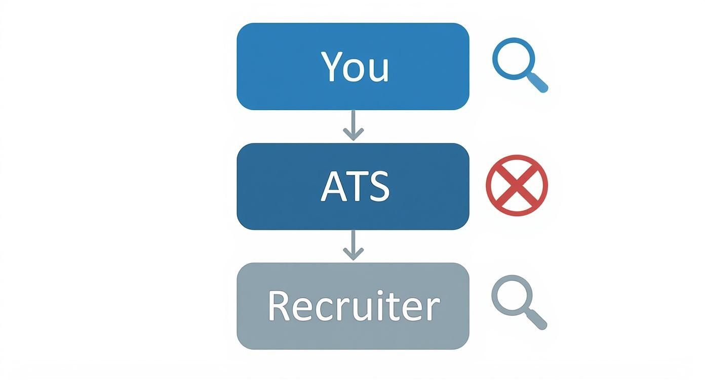
How Applicant Tracking Systems Read Your Resume
Think of an Applicant Tracking System (ATS) as a data entry clerk. Its job is to pull information from your resume and put it into categories, turning your career story into a structured database profile. It is built for efficiency, not design.
When you upload your resume, the ATS first converts it into a plain text file. This process removes all visual formatting, leaving only the raw text. From there, it scans for keywords, dates, and familiar headings to organize the information.
Why Simple Fonts Are Non-Negotiable
This is where your font choice can make or break your application. An ATS has a small, pre approved list of fonts it understands perfectly. If you stick to a common font like Calibri or Georgia, the system recognizes every character, ensuring your data is pulled accurately.
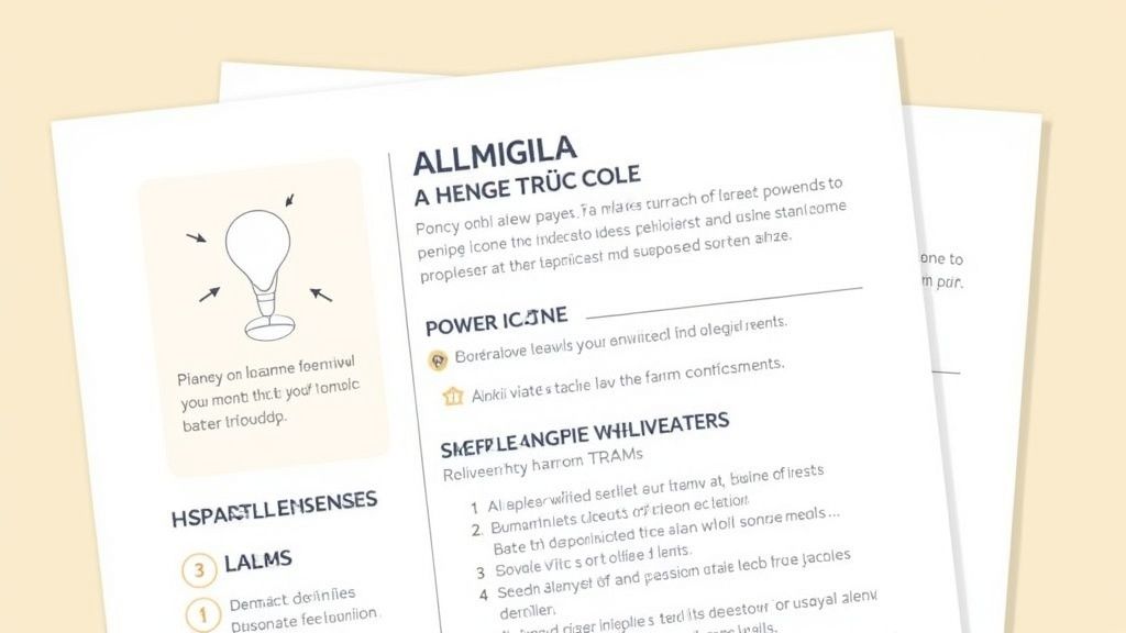
But if you choose a custom or decorative font, you are taking a risk. When the system encounters a character it does not recognize, it can create a parsing error. Your most important skills can turn into a string of gibberish.
For example, a stylized font might render the skill "Power BI" as "P?w#r B!" in the plain text version the ATS reads. That tiny error makes a critical keyword invisible to the system, and your application could be filtered out before a human ever sees it.
The Parsing Process Explained
The parsing process is methodical. The software scans top to bottom, left to right, but it cannot infer meaning from visual context.
Here is a simplified breakdown of what happens:
- Text Extraction: The ATS converts your file to a text only format. It removes images, columns, and complex formatting.
- Section Identification: It then looks for standard headings like “Education,” “Skills,” and “Experience” to map the document’s structure.
- Keyword Matching: Finally, the system scans for specific keywords from the job description, like “SQL,” “Python,” or “data visualization.”
This automated process makes it clear why a simple font is so important. To give your resume the best chance, you should also ensure you are making your PDF resume searchable. If you accidentally save your resume as an image, the ATS will see a blank page.
As a final step, run your resume through one of the 12 best ATS resume checker tools for data professionals in 2025 to catch any formatting issues before you apply. A standard font is the first step in creating a resume that both machines and humans can read.
Top Professional Fonts for Data Analytics Resumes
When you choose a font for your resume, the goal is clarity, not creativity. For data professionals, this is doubly important. You need a font that is easy for a hiring manager to read and simple for an Applicant Tracking System (ATS) to parse. The right choice makes sure your skills, like Python and Tableau, are the main event.
Think of your font as the invisible frame around your work. A good one lets your achievements shine. A bad one is a distraction that signals a lack of attention to detail.
This is exactly how a poor font choice can stop your resume from reaching a human reviewer.
As you can see, the wrong font acts as a gatekeeper. It keeps your qualifications from the people you need to impress. Let’s review the specific fonts that will get you through that gate.
Here is a quick rundown of the top fonts that balance professionalism with ATS compatibility, broken down by serif and sans serif styles.
Top Recommended Resume Fonts for Data Professionals
Now, let's break down why these specific fonts work so well.
Best Sans-Serif Fonts for a Modern Look
Sans serif fonts are the standard in tech and data. They lack the small decorative strokes (serifs) at the ends of letters, which gives them a clean, modern feel. More importantly, they are exceptionally easy to read on digital screens.
- Calibri: This is a safe bet. As a default font in many Microsoft applications, it is universally available and highly compatible with almost any system.
- Helvetica: A classic in the corporate world for a reason. Helvetica is known for its neutrality and clarity, making it a strong, authoritative choice that projects confidence.
- Arial: Another standard font that is available everywhere. It is clean and straightforward, ensuring your resume will display correctly on any device.
Best Serif Fonts for a Traditional Feel
Serif fonts have small decorative strokes that can help guide the reader's eye, which traditionally improves readability in printed documents. They convey a more traditional or established tone. While less common in tech, they are still excellent professional choices.
- Georgia: This is a fantastic serif option because it was designed for screen readability. Its characters are wider and clearer at smaller sizes than many other serif fonts.
- Garamond: An elegant choice that uses less space, which can be a bonus if you are trying to fit everything onto one page. Use a font size of 11pt or larger to keep it readable.
- Cambria: Like Georgia, Cambria was built for on screen viewing. It is a sturdy, well balanced font that holds up well in small sizes, making it a reliable and ATS friendly option.
While new fonts appear often, the classics remain popular. According to a TonerBuzz analysis, Times New Roman is still used by 54.77% of universities, with Arial second at 9.13%. This shows that readability and tradition are still top priorities.
Ultimately, whether you choose a modern sans serif or a traditional serif, consistency matters most. Pick one of these trusted options and let your data skills take center stage. For more tips on formatting, check out our guide on 7 ATS-friendly resume examples for data pros in 2025.
Choosing Between Serif and Sans Serif Fonts
Picking between a serif and a sans serif font is a strategic choice that frames your professional brand.
Think of it this way: a serif font is like a classic, tailored suit. A sans serif font is like smart, modern business casual. Both are professional, but they send slightly different signals.
Serif fonts have small decorative strokes, or "feet," at the ends of letters. Classics like Georgia and Cambria are great examples. Those feet were designed to guide the reader's eye across printed text, which gives them a traditional, authoritative feel.
On the other hand, sans serif fonts do not have those feet, resulting in a clean, modern look. Fonts like Calibri, Helvetica, and Arial are common choices. Their straightforward design is exceptionally easy to read on digital screens, which is where your resume will be viewed almost 100% of the time.
The Modern Standard for Data Professionals
For data and analytics professionals, the consensus is clear: sans serif fonts are the best choice. The tech world values clarity, efficiency, and forward thinking, and sans serif typography fits that perfectly. Its clean lines communicate a sense of order and precision, mirroring the skills you use in a SQL query or a Python script.
An analysis of Fortune 500 branding showed that around 70% of these top companies use sans serif fonts in their logos and official communications. This has influenced resume standards, making fonts like Arial and Calibri the default expectation. You can read more in Linearity's research on font statistics.
When to Consider a Serif Font
While sans serif is the safer choice, a serif font can still be a powerful tool.
If you are applying for a role at a more traditional institution, like a university, a large financial firm, or a government agency, a serif font like Georgia can be a fantastic choice. It carries a sense of expertise that might resonate with a more conservative company culture.
Ultimately, your decision should come down to your target audience. Ask yourself: what is the culture like at the company? A quick look at their website and official documents will give you clues. Your font choice is a subtle way to show you have done your homework.
Simple Rules for Resume Font Size and Formatting
Even the best font will fail if the formatting is a mess. Think of your resume's formatting as the user interface for your career story. Great content with a confusing layout will frustrate the hiring manager trying to scan it in six seconds.
Good formatting creates a visual hierarchy. It guides the recruiter’s eye to your biggest wins and makes your resume feel organized and easy to skim. These simple rules will help you get there.
Setting the Right Font Size
Font size is critical for readability. Too small, and you give the reader a headache. Too big, and it looks amateurish or pushes your content onto a second page.
Stick to this proven formula for a balanced resume:
- Body Text: Keep your main content, like the bullet points under your work experience, between 10 and 12 points. This is the sweet spot for readability.
- Section Headings: Make your headings for sections like “Experience” or “Skills” slightly larger, between 14 and 16 points. This creates visual breaks and helps recruiters jump to the sections they care about.
- Your Name: Your name at the top should be the largest text on the page, usually between 18 and 22 points.
Using White Space Effectively
White space, the blank area around your text and margins, is not wasted space. It is an active design element that keeps your resume from becoming an overwhelming wall of text.
The goal is to create breathing room. A resume packed with text can cause reader fatigue before a hiring manager even gets to your key accomplishments.
The best way to control white space is by adjusting your line spacing and margins. A line spacing setting between 1.0 and 1.5 is perfect. Also, stick with standard one inch margins on all sides to keep the layout clean and prevent text from getting cut off if printed.
Beyond the font and formatting, you must consider the overall length. Knowing the principles behind word count ensures your resume is both concise and impactful. For a deeper look, you can check out general guidelines on how many words an ideal resume should contain.
Build Your ATS-Ready Resume in Minutes
Knowing the rules for resume fonts and formatting is one thing. Applying them perfectly every time can be a difficult manual process.
Instead of fighting with margins and font sizes, there is a smarter way to handle the technical details. An approach that lets you focus on what really matters: your skills, your accomplishments, and your career story.
This is why we built Jobsolv’s free ATS approved resume builder. It is designed specifically for data professionals and automatically includes all the best practices we have covered. No more second guessing your font choices or worrying about ATS compatibility.
Automate Your Formatting
Our builder uses pre selected, ATS friendly fonts and clean templates optimized for data and analytics roles. This means your resume is structured for both machine parsers and human eyes from the start.
It removes the risk of common formatting mistakes that get great applications rejected.
Your real job is to showcase your impact, not to become a document design expert. A good resume builder handles the technical setup so you can focus on explaining your value, like how you quantified the results of a Python script or the story behind that Power BI dashboard you built.
Tailor and Apply with Confidence
Once your foundational resume is ready, you can instantly tailor it for specific remote and hybrid roles you find on the Jobsolv job board. The tool helps you quickly align your experience with the keywords in each job description, ensuring every application is perfectly optimized.
This gives you the confidence that your resume will pass the initial ATS screening and make a strong, professional impression on the hiring manager.
For a deeper dive into how these tools work, check out our guide on the best AI resume builders.
Answering Your Toughest Resume Font Questions
You have built the substance of your resume, but the small details, like font choice, can feel surprisingly important. Let's clear up the most common questions data professionals have so you can finalize your resume with confidence.
What Is the Single Best Font for a Resume?
There is no single "best" font, but if you want a universally safe bet, you cannot go wrong with Calibri or Helvetica.
Think of them as the Python of fonts: clean, modern, and universally understood. They are exceptionally readable on screens where recruiters will view your resume and work well with every Applicant Tracking System.
Can I Use a Custom Font to Stand Out?
I strongly advise against it. Using a custom or downloaded font is a huge risk that almost never pays off.
These fonts are known for causing parsing errors in an ATS, which can turn your skills and experience sections into a garbled mess. Always stick with standard, system native fonts to make sure your resume is read correctly.
Using a custom font is like writing your SQL queries in a language the database does not understand. The command will fail. The goal is successful execution, not creative syntax.
Should My Cover Letter Font Match My Resume Font?
Yes, absolutely. This is non negotiable.
Using the same font, size, and formatting across your resume and cover letter creates a cohesive, professional brand. It is a subtle signal that tells the hiring manager you have a keen eye for detail and have put real thought into your application.
Ready to stop worrying about fonts and start building a resume that gets results? The Jobsolv free ATS-approved resume builder automatically applies all these best practices for you. Create a perfectly formatted, data-focused resume in minutes at https://www.jobsolv.com.


